
The Edit: Details & stationery
The Details That Make a Wedding Feel Cohesive
Stationery, materials, table objects and the building itself can speak one visual language. How to choose details that repeat and reinforce each other, and how to leave out the ones that only add more.
Guests rarely notice a single detail on its own. What they notice is whether the details agree. An invitation whose paper and type feel related to the venue, a menu that matches it, place cards in the same hand, a table where the materials echo the walls: together these give the sense that the day was thought through as a whole.
When the details disagree, the wedding looks assembled from separate decisions. It takes very few mismatched pieces for that to happen.
Take the language from the building
The venue has a visual language already: its materials, the lettering on a gate or a door, the shape of its windows, the texture of its walls. Details that borrow from it look connected to the place. Details chosen from a trend or a template look like they could belong anywhere.
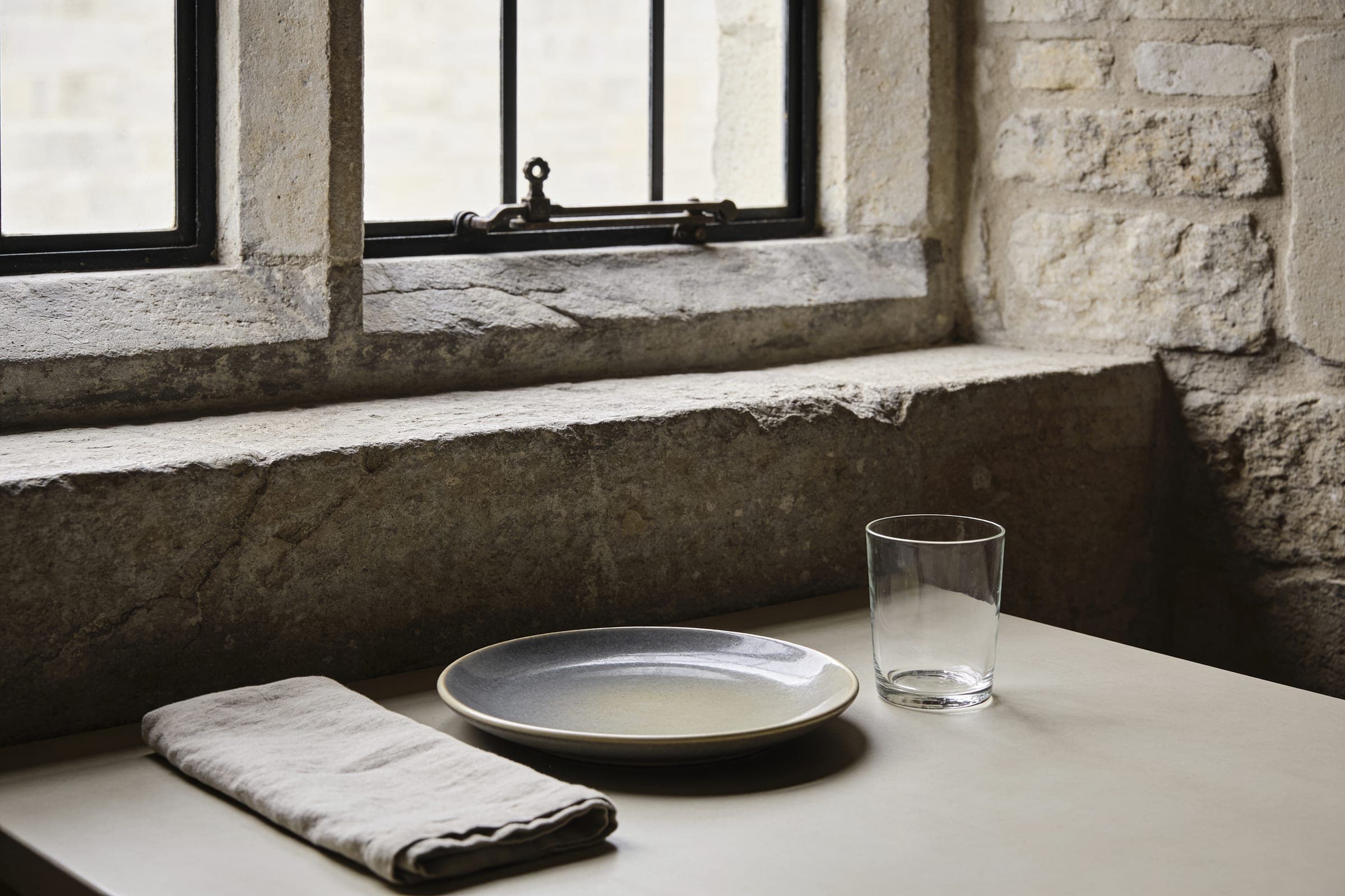
This can be quite literal. A stone building suggests heavy, textured paper. A glasshouse suggests something lighter, perhaps with fine lines that echo the frame. A timber barn suggests natural paper and simple type. Details are how the style built around the venue reaches the hands of guests.
A detail earns its place when it repeats something the setting already says.
Stationery as a system
Stationery is the first thing guests see of a wedding and often the last thing they take home. It works best as one system: the same paper, type and color used for the invitation, the day's information, the menu, the place cards and any signs. Deciding the system once and applying it everywhere is easier than designing each piece separately.
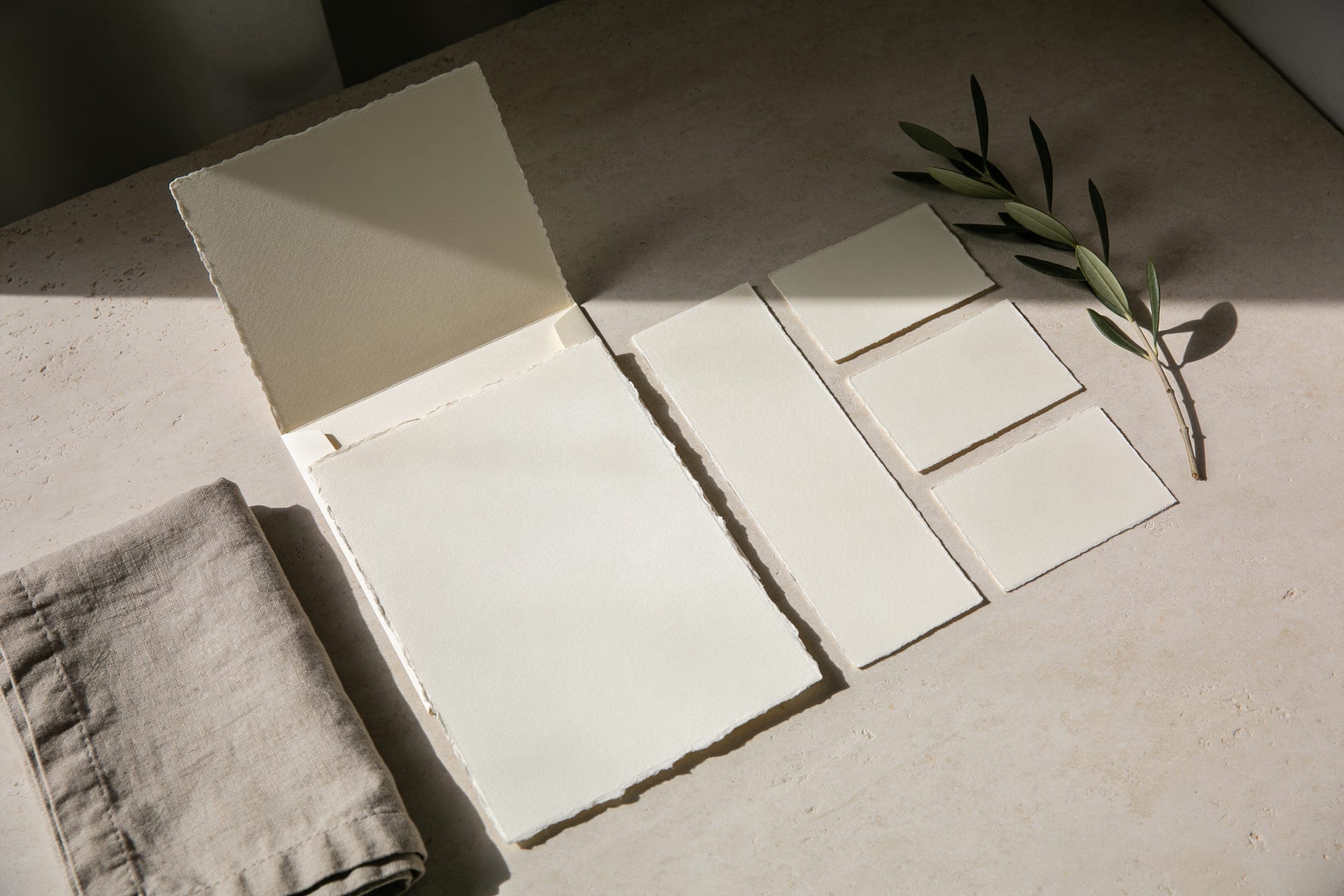
- Paper. Its weight and texture say more than the design printed on it.
- Type. One or two typefaces, used consistently. Legibility first, especially for information guests need to find quickly.
- Color. Taken from the wedding's palette. See wedding color palettes.
- Handwriting. Names on place cards or envelopes, if used, should be consistent across every piece.
Materials that repeat
Choose a small number of materials and repeat them. If the venue is stone, the tables might use linen in a stone color and ceramic plates with a matte finish. If it is a glasshouse, clear glass and fine metal can echo the structure. Repetition across the building, the table and the stationery is what makes the details read as one idea. Wedding tablescapes shows how this works on the table.
Seen from across the room, seen in the hand
Details work at two distances. Some are seen from across a room: a sign at an entrance, the color of the linen, the line of candles down a table. These need to be simple and legible, because guests take them in at a glance. Others are seen in the hand: an invitation, a menu, a place card. These can carry finer type, a texture, a small drawing of the building.
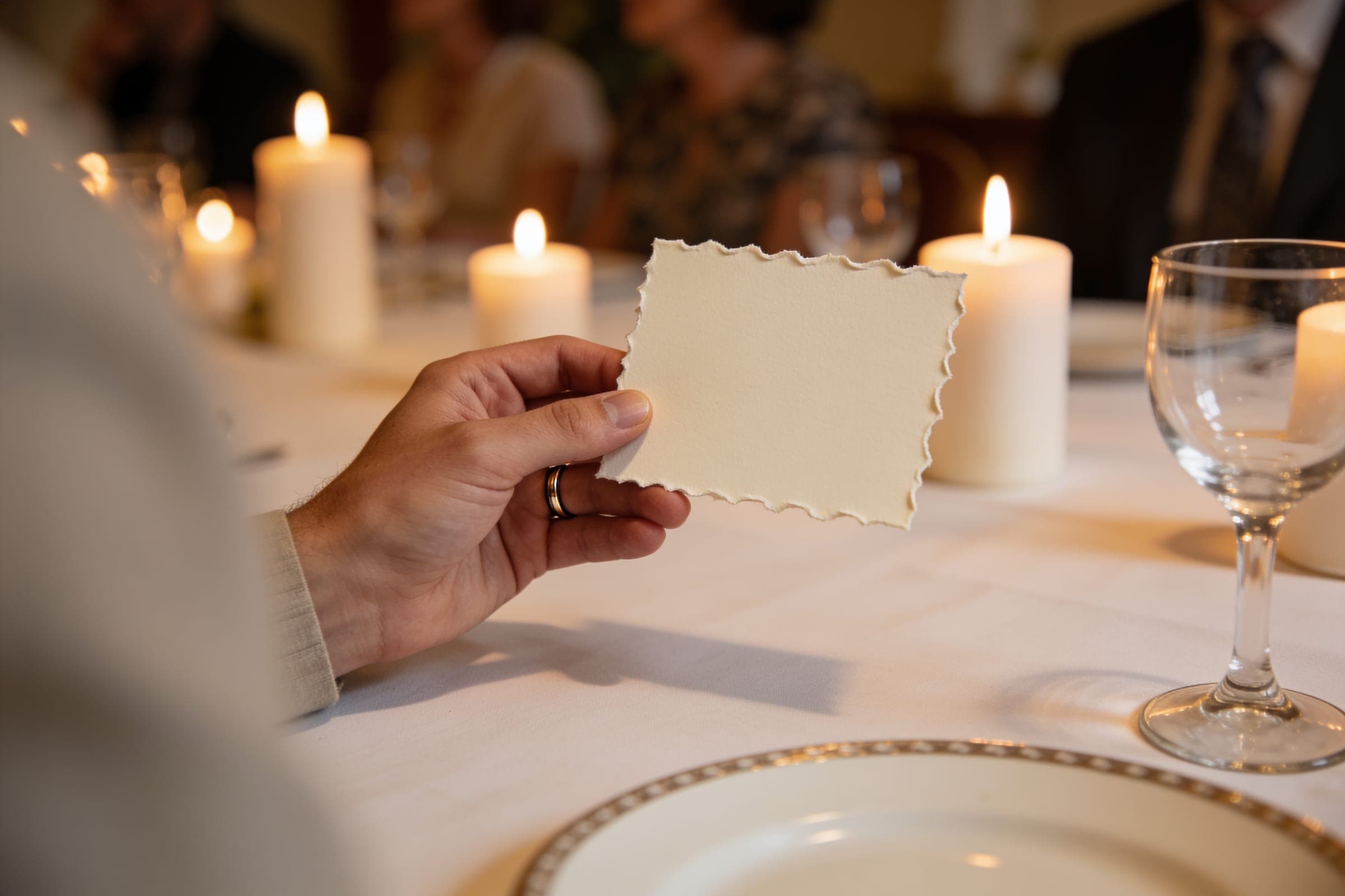
Problems usually come from mixing the two. Fine detail on a large sign cannot be read. A bold, simple menu can feel generic up close. Decide which distance each piece is for before designing it.
Which details are worth including
Usually worth it
- Place cards, which help guests and can carry the stationery system to the table.
- A menu at a seated dinner, where it tells guests what to expect.
- Clear signs where guests need direction.
Often not
- Objects on every place setting with no use.
- Signs that restate what is already obvious.
- Themed items that refer to an idea rather than the place.
Each added detail is one more thing to design, source, set out and clear away. Fewer details, each chosen with care, make a stronger impression than many.
Where to look for inspiration
Look at the venue closely: doors, ironwork, floor tiles, the color of old paint. Look at the landscape outside. Look at the season, and what grows. These give details a reason. Wedding flowers that belong in the setting applies the same approach to flowers.