
The Edit: Color palettes
Wedding Color Palettes: Start With the Place
Every venue already has a palette: its stone, timber, planting, light and season. Choosing wedding colors from that starting point gives a scheme that looks resolved, where a palette chosen in isolation often fights the room.
Palettes are usually chosen before the venue is visited, from a set of swatches or a favorite image. The colors then arrive in a place that has colors of its own, and the two do not always agree. A cool gray-blue scheme can look cold in a warm limestone courtyard. A bright spring palette can look out of place in a timber barn in October.
Starting with the place reverses the process. First notice what colors are already there and cannot be changed. Then decide what to add.
Read the fixed colors
Visit the venue, ideally at the time of day and year of the wedding, and note the colors that will be present no matter what you do:
- Materials. Stone, brick, plaster, timber, glass, floors. They usually make up most of what guests see.
- Landscape. The green of the garden, the color of the fields, the sea, the hills.
- Light. Warm evening sun, cool coastal light, candlelight after dark. Light changes every color in the room.
- Season. What is growing and what color the leaves are.
These colors are the base of the palette. What you add should work with them.
Tone first, then accent
A simple way to build a palette is to choose two things: a tone that sits close to the setting, and one accent that contrasts with it. The tone covers large areas like linen, stationery and most of the flowers. The accent appears in smaller amounts: a flower, a ribbon, a glass, a candle.
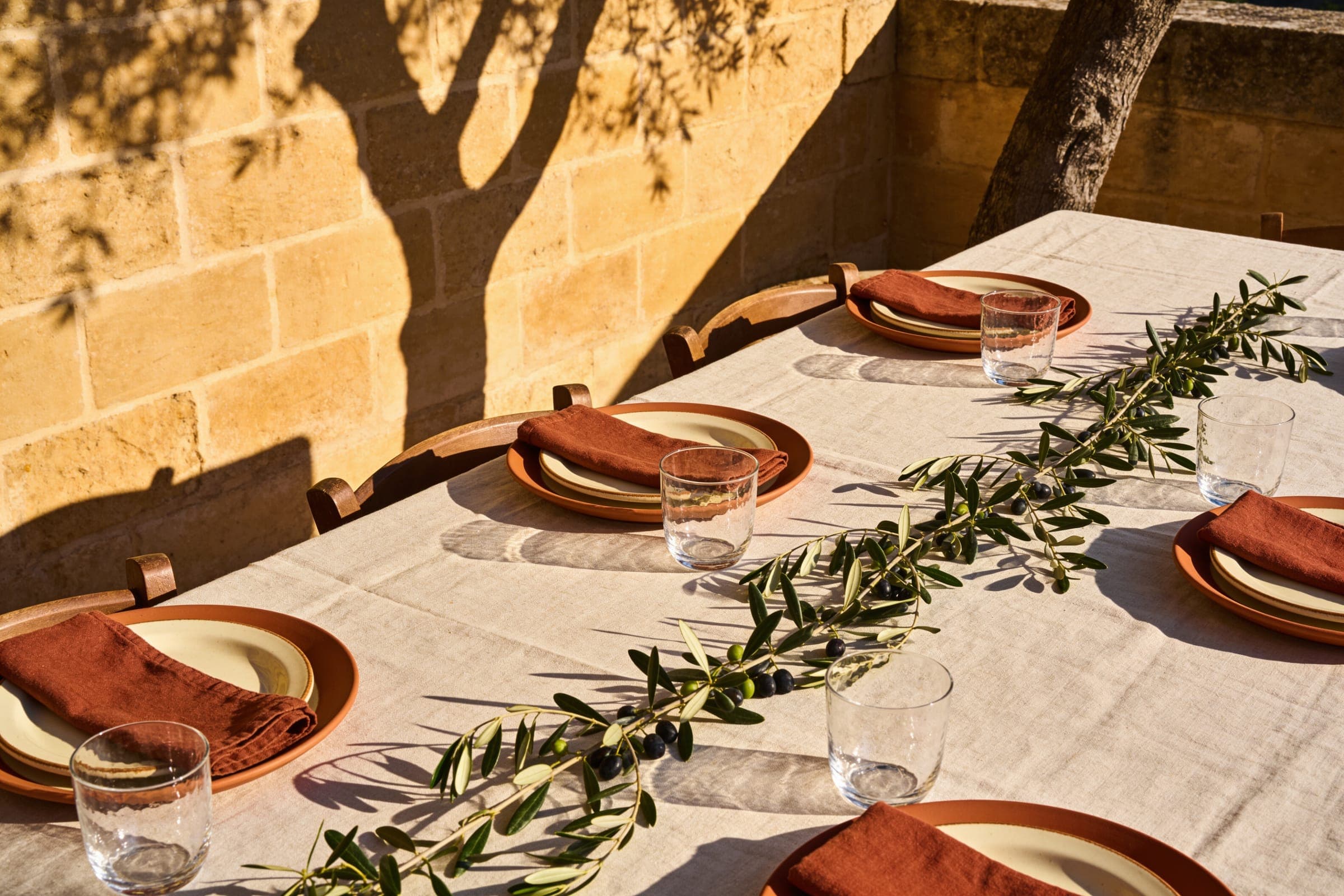
One accent used with conviction reads more clearly than four used cautiously.
Restrained palettes usually photograph better and feel calmer in person. They also leave the setting as the main source of color, which is often the point of choosing it.
Five restrained families
These are starting points drawn from common settings, not a menu. Each describes what the place gives and what tends to sit well with it.
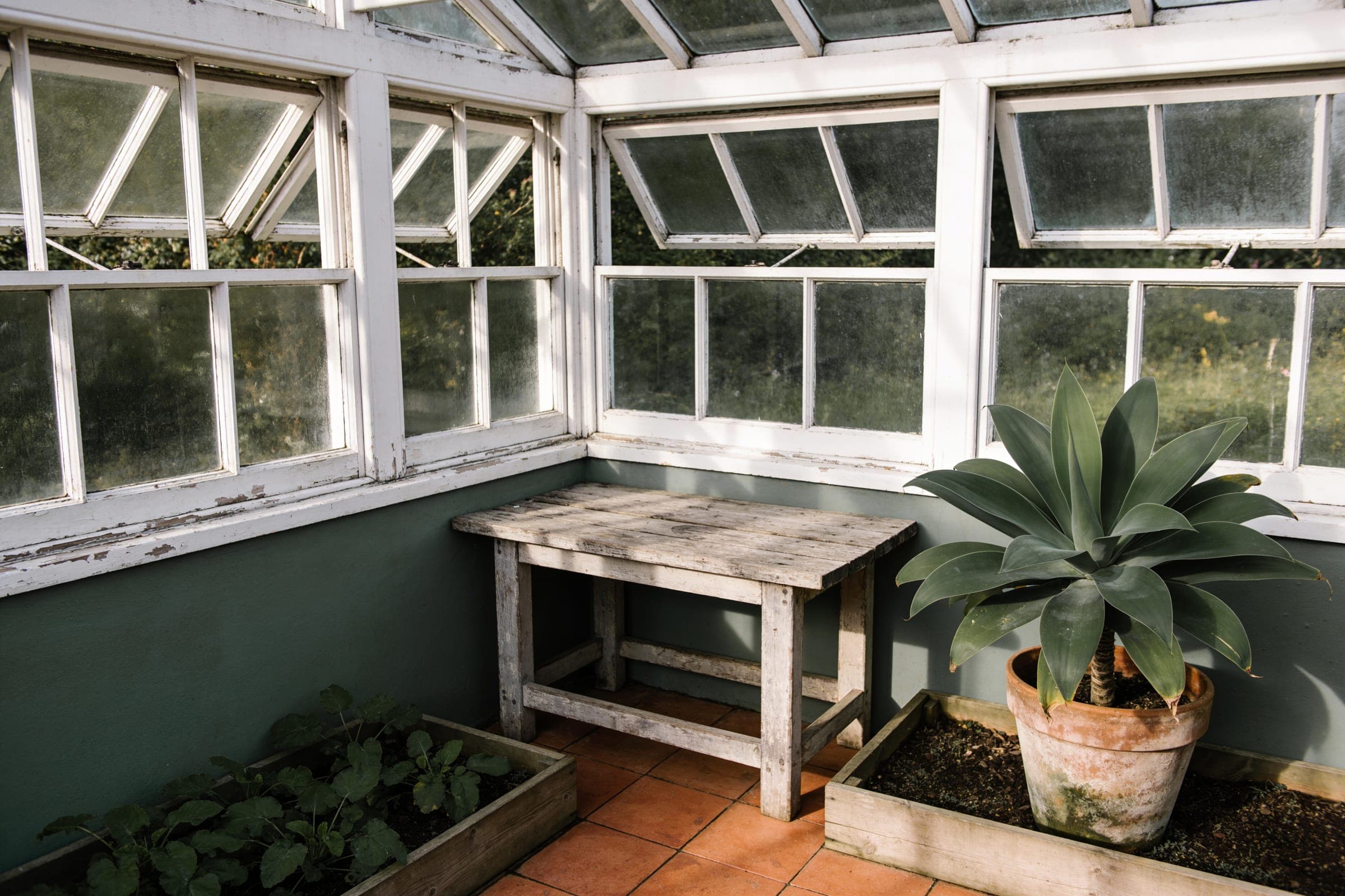
Ivory and sage
- Where it comes from
- Gardens, glasshouses and pale interiors, where green is already dominant.
- What it pairs with
- White and cream flowers, washed linen, clear glass. A deeper green or a single warm flower as the accent.
Stone and olive
- Where it comes from
- Warm stone buildings, terraces and Mediterranean landscape.
- What it pairs with
- Oatmeal linen, terracotta, olive branches. A rust or deep red accent against the stone.
Coastal mist
- Where it comes from
- Pale sand, gray-blue water and cool, bright light.
- What it pairs with
- Sand-colored linen, white flowers, clear glass. Something warm, like terracotta or apricot, so the table does not disappear into the view.
Muted autumn
- Where it comes from
- Countryside, vineyards and barns in late season.
- What it pairs with
- Timber, rust, ochre and dried grasses. Deep burgundy or plum as the accent.
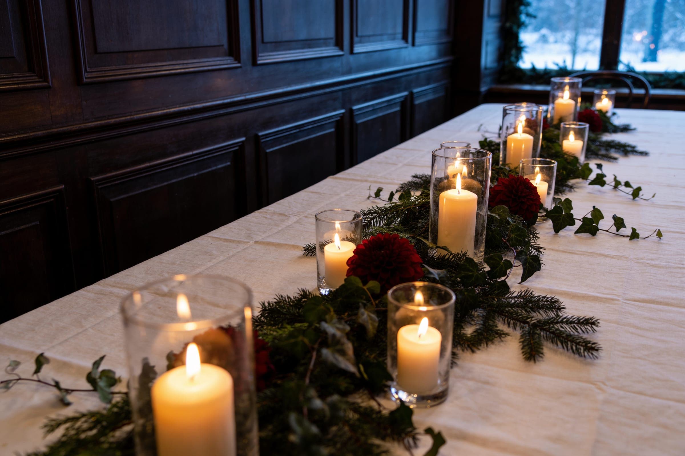
Winter green
- Where it comes from
- Evergreen planting, dark rooms and candlelit evenings.
- What it pairs with
- Dark green foliage, white linen, candlelight. Deep red or dark wood as the accent.
For the reasoning behind seasonal choices, see wedding ideas by season.
Where color appears
Color is carried mainly by four things: flowers, linen, stationery and what people wear. Deciding which of them carries the accent avoids repeating it everywhere. If the flowers carry it, the linen can stay quiet. If the stationery uses it, the table does not need to. Wedding flowers that belong in the setting, wedding tablescapes and the details that make a wedding feel cohesive look at each of these.
The palette is one expression of a broader idea: building the whole wedding style around the venue.